Shareholdership Reimagined
Case Study — FINTECH


Making investing simple, engaging, and rewarding.
Stay.Gold worked to create an intentional new brand design and identity, including brand strategy, positioning, identity design, and the brand tooling needed to succeed. We wanted to reshape the perception of the market by creating an emotion-driven brand with excitement and clarity around the financial space. We started with an ideation process around naming, grounded in a strategic approach rooted in audience insights to define the values, mission statement, and brand positioning. Working in a sprint model, we landed on the name Shareclub: A company that strengthens the relationship between brands and consumers through shareholder rewards.
No.1 — BRAND IDENTITY

No.2 — BRAND CONTENT

Brand Strategy
Identity Design
Art Direction
Brand Activations
Services made to be shared —
STAY.GOLD DELIVERS

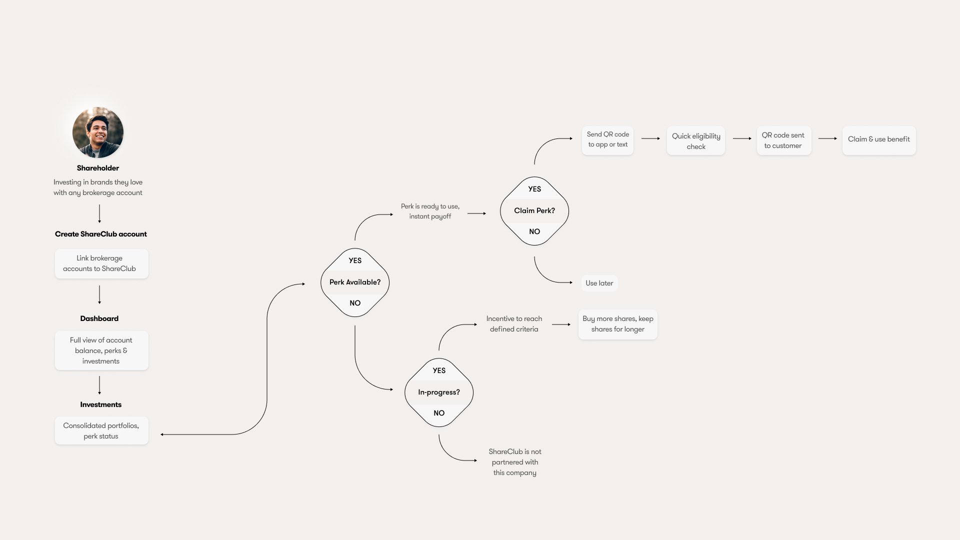
No.3 — PRODUCT STRATEGY

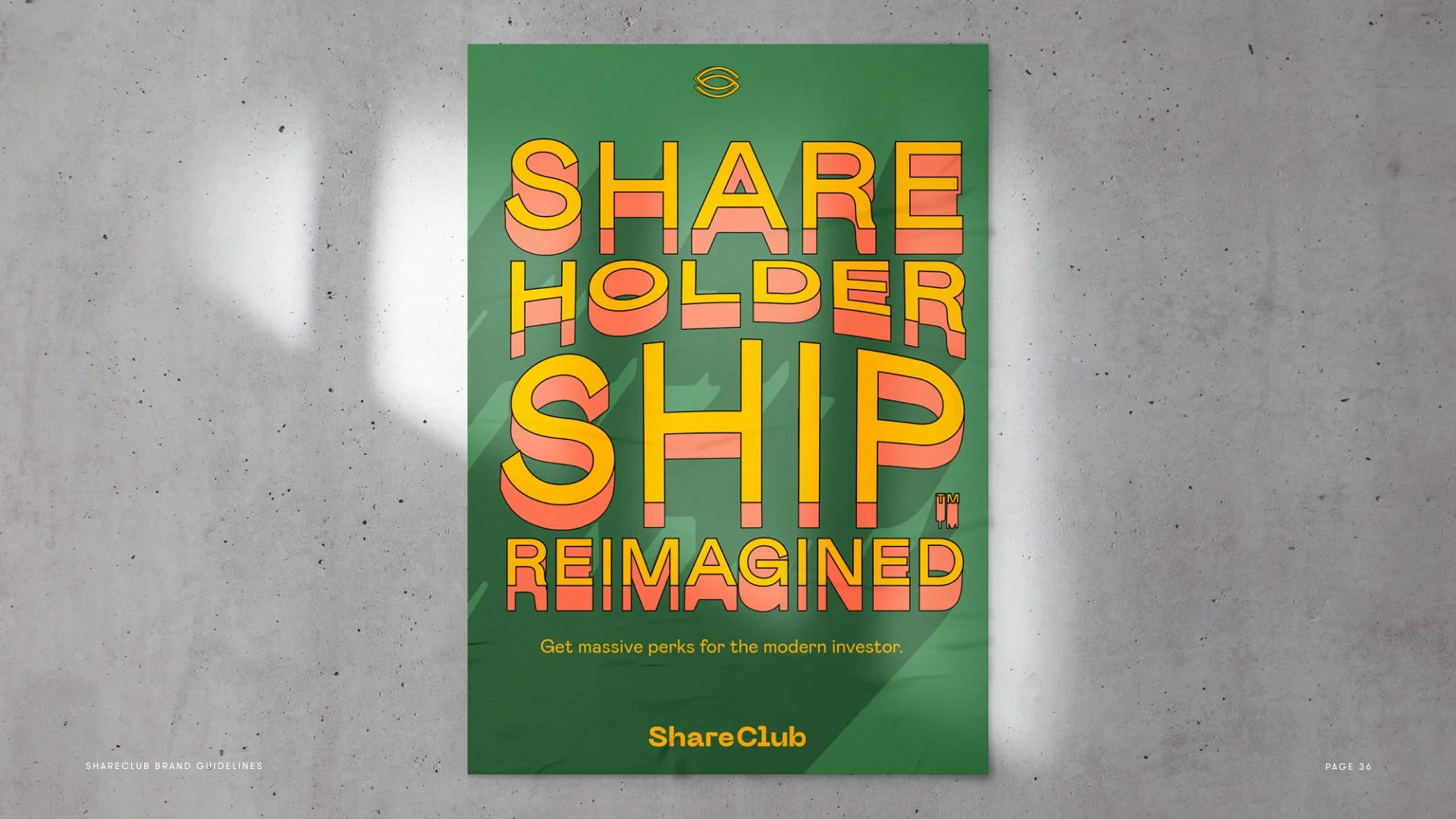
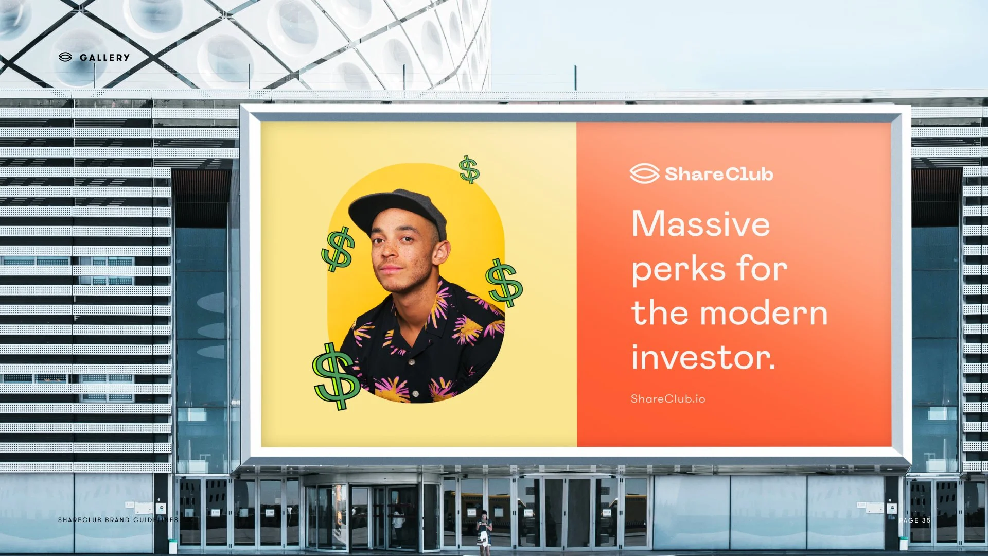
No.4 — MARKETING DESIGN

No.5 — BRAND STRATEGY
Identity with intention
STAY.GOLD DELIVERS
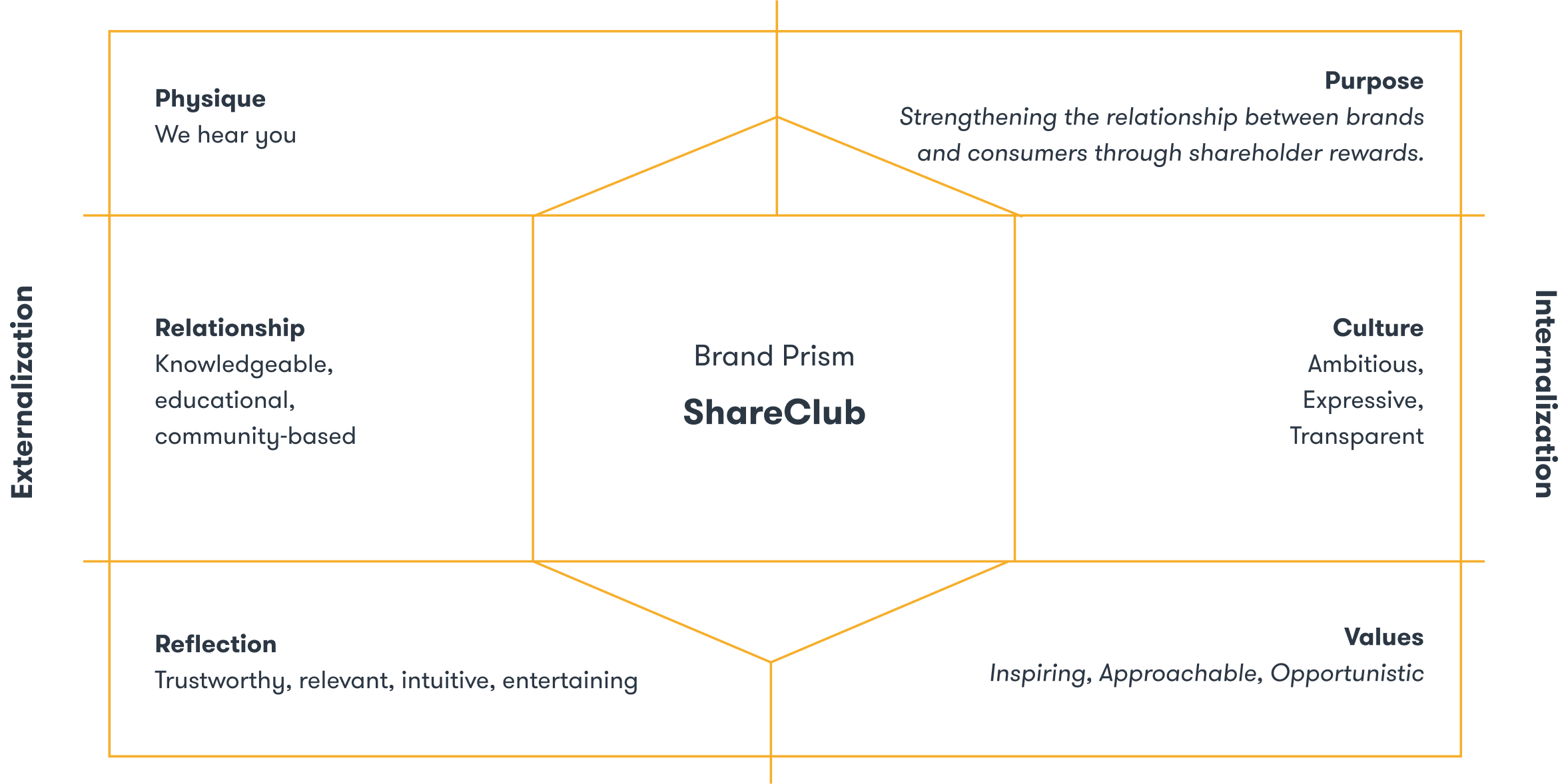

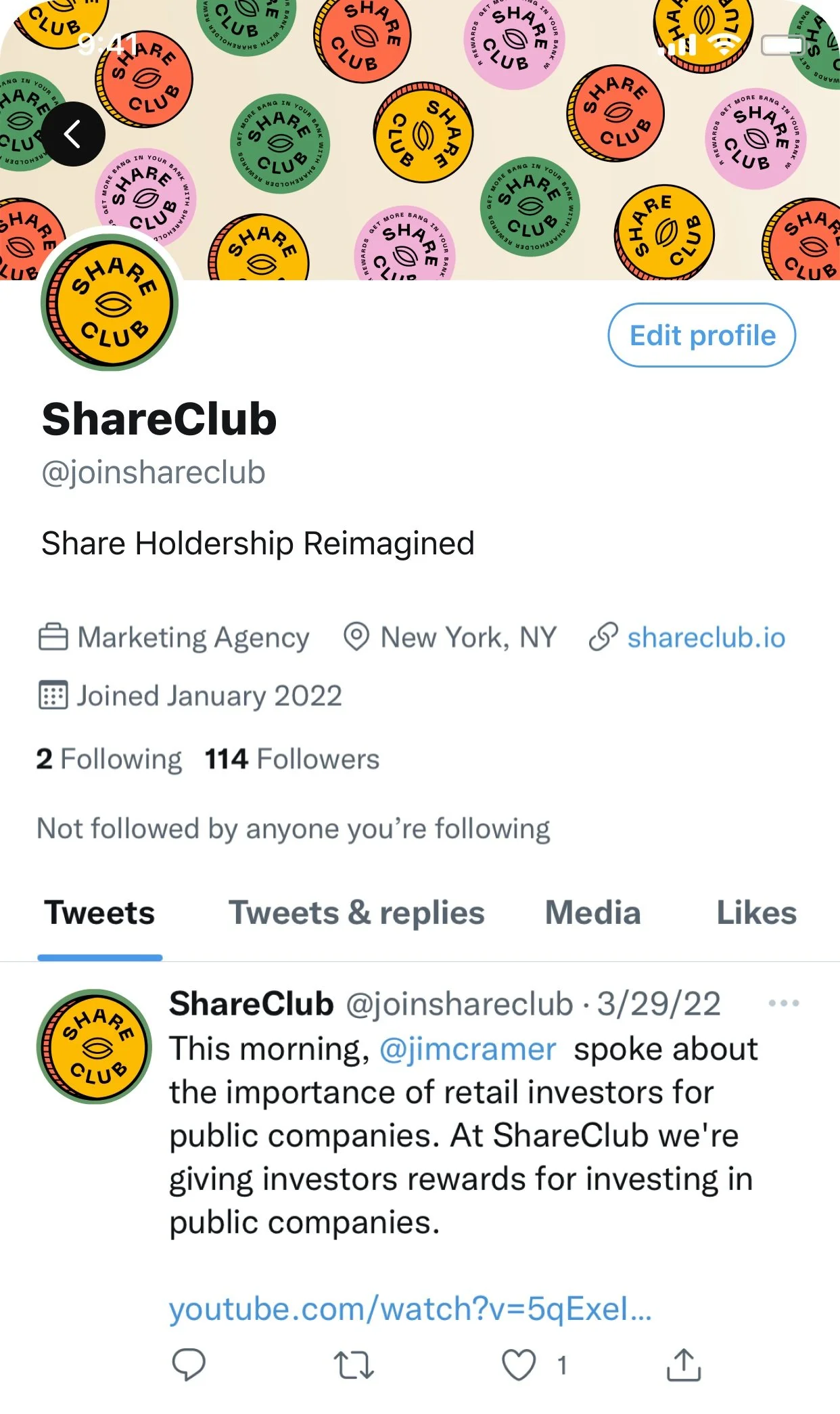
Public Companies are searching for new ways to inspire consumers to purchase, and have overlooked a large and loyal audience of potential customers: their shareholders. ShareClub is a platform purpose-built to strengthen the relationship between brands and consumers through shareholder rewards.
Let’s change the market, together.
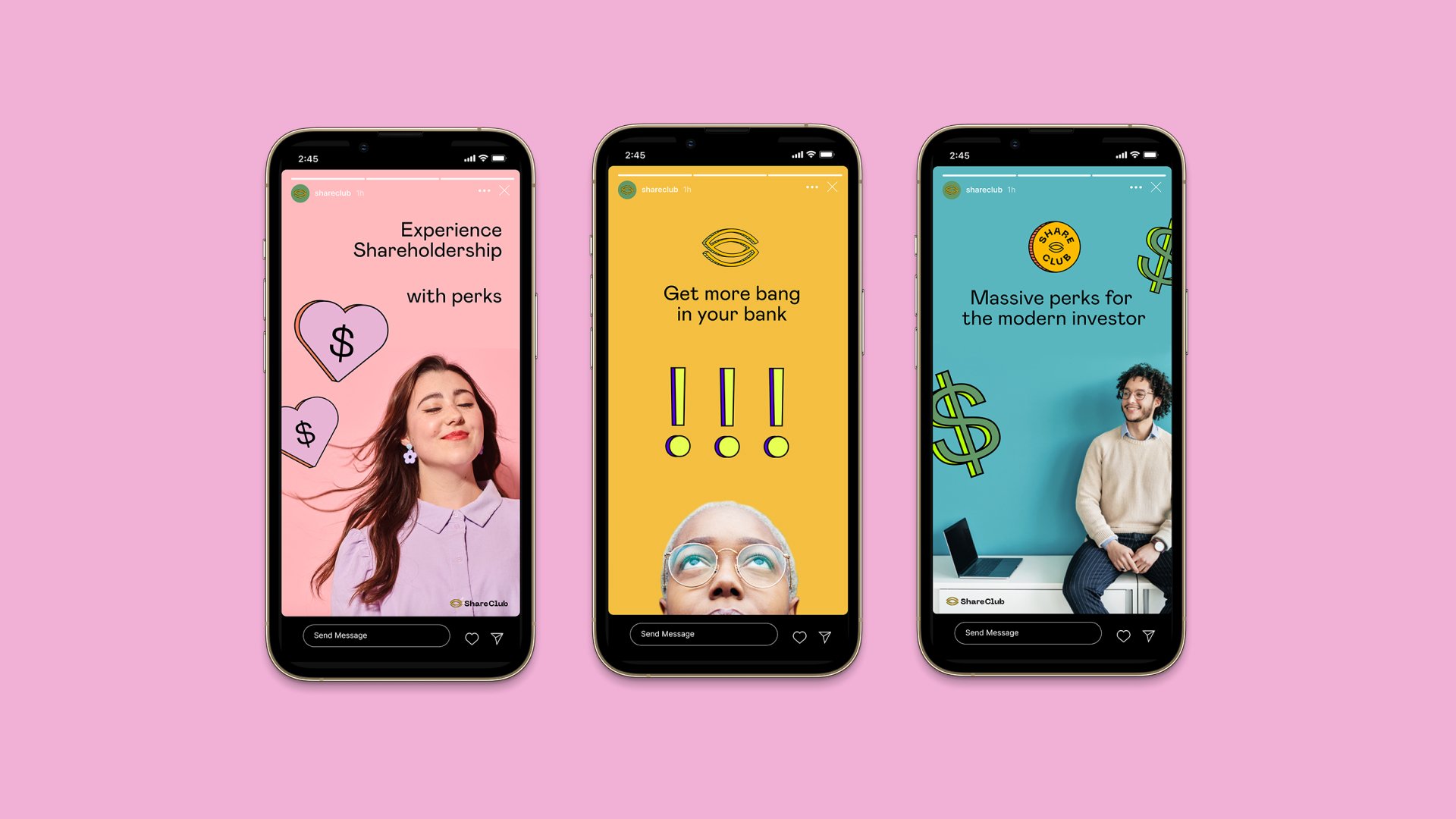
No.5 — SOCIAL ACTIVATIONS


Making investing simple, engaging, and rewarding.



No.6 — BRAND TOOLKIT
Synopsis —
As a world-class digital brand and experience studio, Stay.Gold was charged with the task of crafting a brand identity for ShareClub, a financial technology start-up. With a unique product offering at the core, the challenge was to forge a brand that would rise above the competition and truly shine.
Determined to uncover the essence of ShareClub's target audience, we delved into market research and consumer insights to uncover their desires and aspirations. This foundation informed the creation of a brand positioning and messaging strategy that spoke to the hearts of ShareClub's customers.
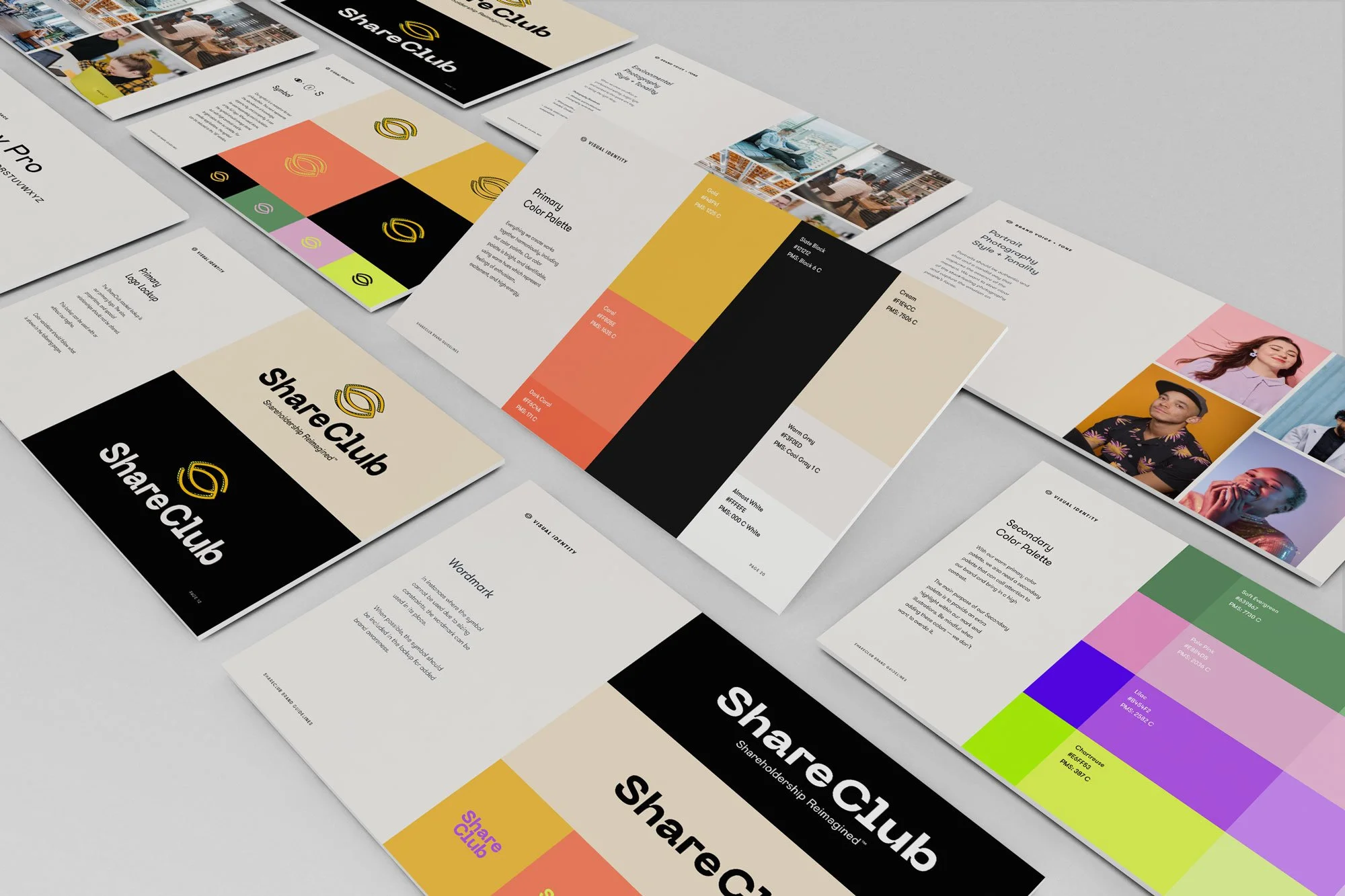
Our team of brand alchemists then worked their magic, conjuring a visual identity that was both bold and unforgettable. A logo that left a lasting impression, a wordmark highlighting ShareClub's name, and an illustration toolkit that brought the brand to life, and a comprehensive brand guidelines document to ensure consistency at every touchpoint.
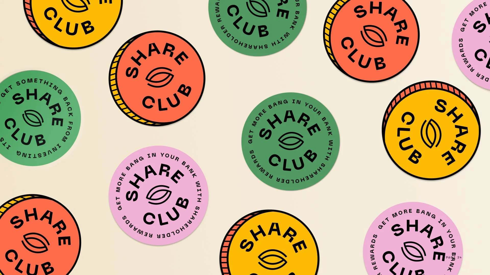
With a newfound product-market fit, ShareClub has seen a surge in user acquisition and engagement since the rebrand. The new visual identity has helped the brand stand out in a crowded market and connect with its target audience in a profound and meaningful way. To further promote the brand and foster a sense of community among ShareClub's customers, we also created brand merchandise such as T-shirts, bags, and stickers.
…
Date:
2022
Role:
Agency of Record
Duration:
3 months
Delivery:
Brand Platform